
Philips DLS & Icon Font
Challenge
Philips' digital products spanned desktop and mobile but lacked a unified visual language, leading to inconsistency across interfaces and friction in the design process as teams worked without shared foundations.
Approach
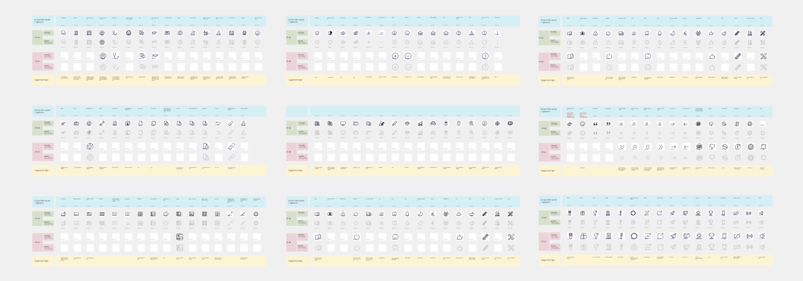
Contributed to the development and maintenance of the Philips Design Language System, establishing a cohesive visual identity across digital touchpoints. Designed a comprehensive global web icon font, ensuring every icon met standards for consistency, clarity, and usability at all sizes and contexts.
Outcome
The icon sets enhanced user experience across Philips' digital products, supporting seamless interaction while maintaining a consistent visual identity across all interfaces worldwide.
Full case study coming soon.